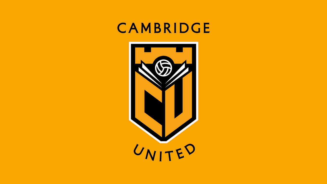
Cambridge United is proud to reveal its proposed new Club Crest following months of consultation, workshops and time spent designing a new identity for the Football Club...
Following the initial announcement in May that the Club would be beginning the process of a public consultation to explore a new Crest, a survey was sent out to over 27,000 fans which aimed to understand the appetite for change.
The results of the survey indicated that there was an desire to look at a possible change, and the Club moved forward with the project, working alongside design agency, North, and in consultation with staff, the Shadow Board and Club Board.
Today we are pleased to reveal our proposed design for supporters to take in and digest, ahead of a further survey which will be issued next week.
Message from Paul Barry...
At Cambridge United we aim to be a modern, progressive, sustainable and well-run football club at the heart of the community we serve. A Club that creates moments and memories that can last a lifetime.
We are proud of our past. Equally we are ambitious for the future. The multi-million pound investment in the last two years to upgrade the training ground and buy back the Abbey Stadium are signals of our collective intent.
We firmly believe that our best days can lie ahead and we know that you, the fans, share that ambition.
We are also very proud of our city - its past, present and future. It is a place that attracts millions of people every year from every part of the world and is a name that is globally recognised.
To continue progressing, we will need to continue investing within an ever more financially competitive environment. That means using every asset we have, and we believe our identity is critical.
Our visual identity and what it says about us is important not just to our fans but also to potentially millions of people visiting the city every year.
Whatever different views of our current Crest's design, we recognise that there is of course affection for it.

For many it is all they have known and for all it represents something we all love - our football club. It has heritage through use but when it was designed in 1986, was done so without any reference to our history.
We believe we can do better - most critically, have something that better reflects our identity and history as a Club and city. Our city is the birthplace of the rules of the game and gave football to the world. We should celebrate that again.
From Owners and Board down, there is a high level of excitement for what has been created and we are grateful to the Shadow Board for their important contribution over recent months.
We firmly believe this new crest design takes us 'Back to the Future'. As with anything new, it does take some time to consider and reflect on. We will be putting out a survey next week to get your views. We hope you like it too.
How we got here...
The Club was faced with two choices - Revolution or Evolution. Revolution would mean trying to re-invent and reposition ourselves by completely changing the crest, retaining none of the existing features.
Evolution would see us look back at our previous crests and history and reintroduce elements that give it that historical link in a modern way. There have been many different Club Crests since our birth and studying these provided us with so much inspiration.
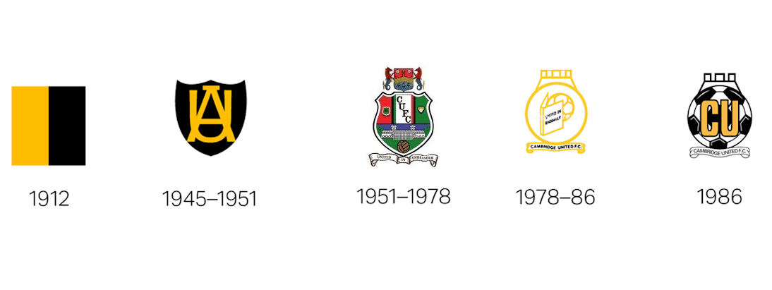
The results of the supporter survey showed that the consensus was to go with evolution and having gone through the early design process, it was agreed that this was the best way forward.
Dissecting the Design...
Imagining a new future...
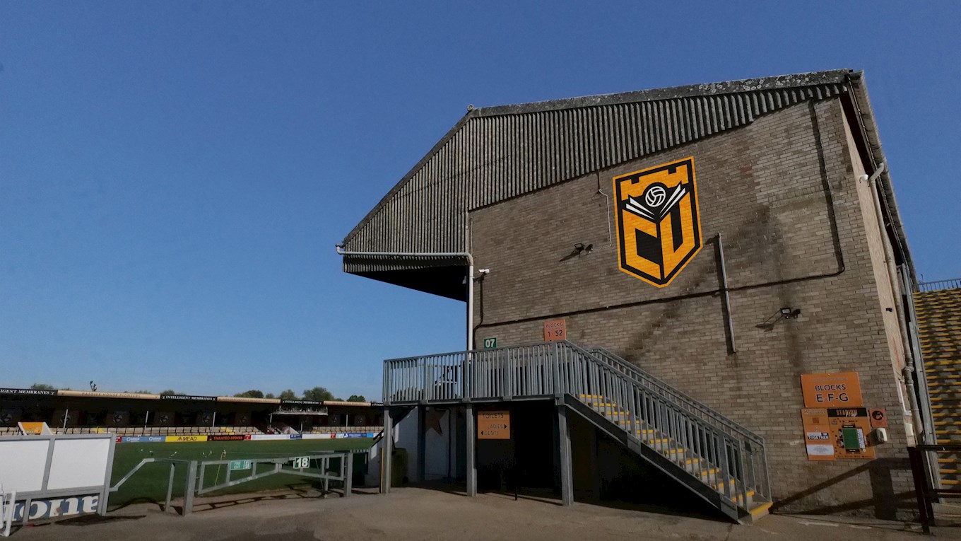
We believe that we have created a Crest which honours the Club's past whilst looks ahead to the future. It's clever but simple design re-imagines several traditional elements that have resonance with the Club and its supporters.
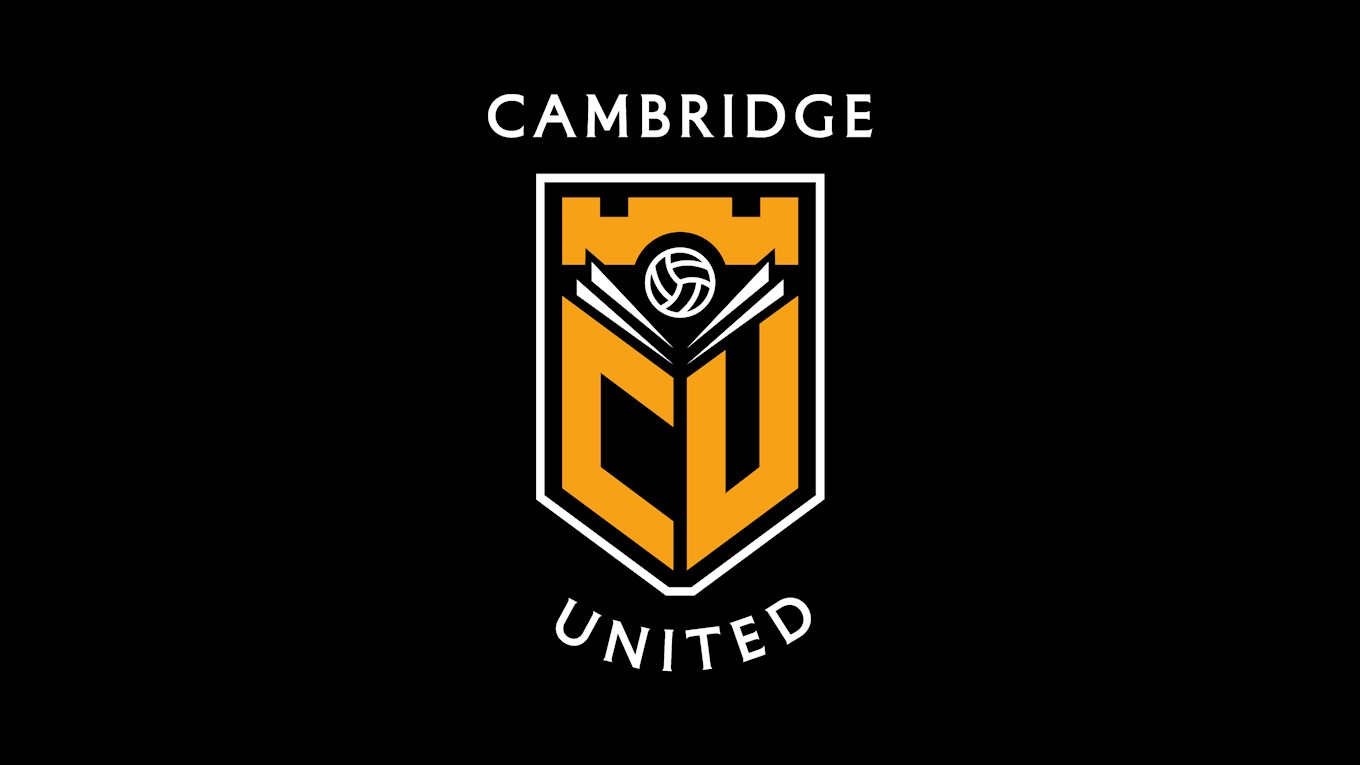
The proposed new Crest is flexible but always recognisable. The border colour can be changed from amber to white depending on where it sits. The Cambridge United text can be included or removed.
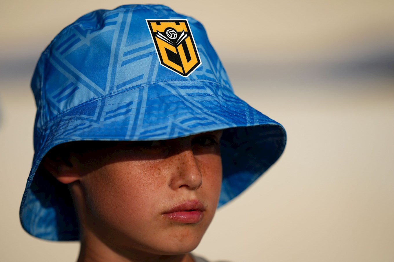
The below set of images incorporate the proposed Crest into real-life situations, allowing fans to imagine what a new future for the U's could look like.


The Club would like to place on record its sincere thanks to North - who worked alongside the Club pro-bono - for their hard work and collaboration over the past few months.
A final survey to obtain the views of fans on the new crest design will be issued next week.
